Features
Webforms works offline
Previously you could open a webform and then book mark it in order to be able to access that webform offline. Now, in version 21.01, the entire webforms page works offline. If you visit webforms while connected to the network all of the surveys that you have access to will be automatically downloaded and cached. Then if you go offline you will still be able to open these surveys.
Note there are some restrictions with this feature. If you have media files in your survey then these will not be automatically downloaded. If this is the case make sure that you open the survey while online. Once you have done this the media files will have been downloaded and cached and you will be able to access the survey though the webforms page while offline. In addition files required for language translation are not automatically downloaded. Hence you should open at least one survey before going offline to ensure that you have the language file for your language (English, Spanish etc).
A new look for the server
One of the challenges of maintaining a large server application over time is that the software frameworks that are used to manager the user interface change over time and it can be a lot of work to update old pages to match new ones. So the Smap server has web pages implemented using multiple technologies and with different appearances.
This release introduces a concerted effort to make these pages more consistent, simpler and faster. Of course that means introducing yet another technology version and style! In this case Bootstrap 4.5. However all the pages in the administration module along with the console have already been converted. Our aim is to convert and make consistent at least one other page per future release. Sol please bear with us while we work our way through this transition.
We have also standardised on horizontal menus across the top of the page. For no particular reason! Although they do use less screen space than vertical menus.
One advantage of the new pages is that they work much better in mobile phones.
Converted the user management page into two pages
The user management page now only has tabs for aspects of managing users:
- Users
- Projects
- Organisations
- Enterprises
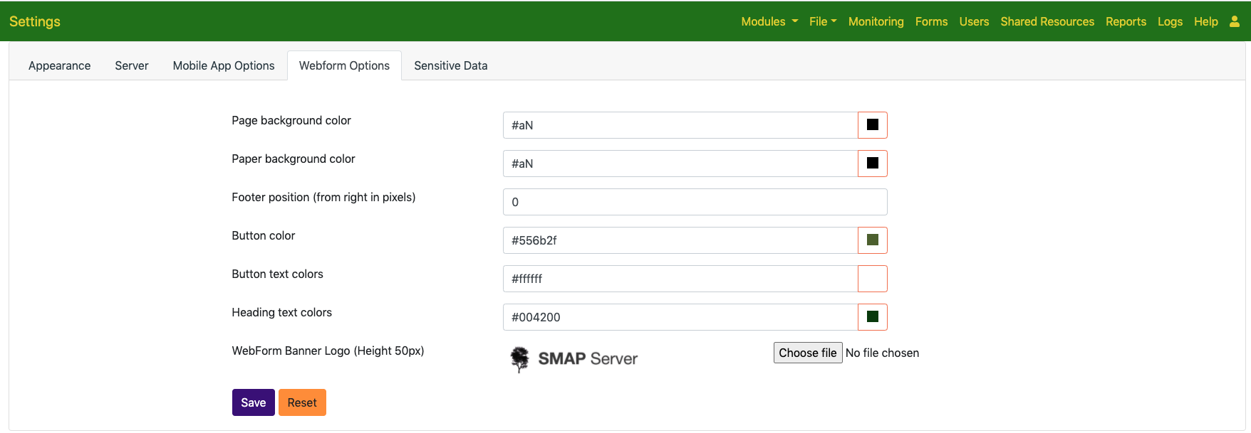
All the other tabs that were also on that page are now on a Settings page:

Other
- The font colour of the navigation menu can be specified in the appearance tab of the settings page
- Appearance options for an organisation can no longer be set in the organisations tab. This tab is used by administrators to manage multiple organisations. Instead appearance is set in the appearance tab by administrators of an individual organisation.
- Setting of the webform banner image has been moved to the webform options tab on the new settings page.
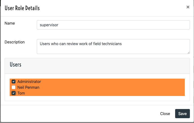
- Users can be added to a security role in bulk. When creating or editing a role select the “Users” panel to add or remove users.

- Add a menu option to access Web Forms from the home page
- Add an option to select the logo used in a reports for a form. This logo can be specified in the settings dialog in the online editor and is selected from images in shared resources.
- Add support for embedding Quicksight dashboards into the server
